Clean Bandit's New Eyes
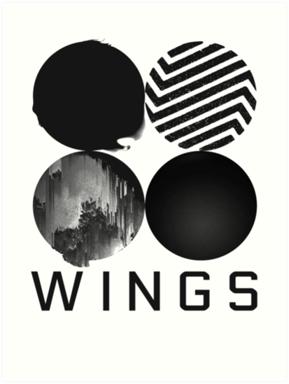
Yes guys, I also do listen to songs in English. Truth be told, when I saw Chris's email about posting a visually compelling album cover, I immediately thought about posting BTS's WINGS cover. It's literally just 4 abstract circles but each circle has a deeper meaning shown through a series of videos. The whole thing uses an achromatic color scheme, and it's beautiful yet so simple.

This picture of the cover has their signatures on it so please ignore the black text. This was pretty much the only high resolution photo I could find on Google. When you first look at it, it is a lot to take in what with all the greenery and the reflective surfaces. You almost miss the fact that the band is standing on the balcony in the top left corner. But I absolutely love the different textures and the depth of the middle diamond they're able to achieve through combining the different aspects of the cover together. It uses the same collage technique that our next project is centered on but instead of newspaper clippings, it uses a single colored photograph. Since their album is called New Eyes, I think the usage of the color green, white, and light blue are extremely fitting as these colors usually invoke a sense of "refreshment" or "new life" from us. The whole thing looks super messy when you first look at it and kind of chaotic, but I think it's very cleverly designed and put together.
Please feel free to look it up if you're curious! I also linked it in the word "WINGS" above so just click on it to see what it looks like. But I digress. This post is about Clean Bandit's cover to their album New Eyes.

This picture of the cover has their signatures on it so please ignore the black text. This was pretty much the only high resolution photo I could find on Google. When you first look at it, it is a lot to take in what with all the greenery and the reflective surfaces. You almost miss the fact that the band is standing on the balcony in the top left corner. But I absolutely love the different textures and the depth of the middle diamond they're able to achieve through combining the different aspects of the cover together. It uses the same collage technique that our next project is centered on but instead of newspaper clippings, it uses a single colored photograph. Since their album is called New Eyes, I think the usage of the color green, white, and light blue are extremely fitting as these colors usually invoke a sense of "refreshment" or "new life" from us. The whole thing looks super messy when you first look at it and kind of chaotic, but I think it's very cleverly designed and put together.
~Sherry
Comments
Post a Comment